

Cyrus Kiani
Founder / CEO


Key takeaways
Point | Details |
|---|---|
UI design drives startup success | Effective UI/UX design transforms ideas into scalable, user-centered products that boost retention and brand identity. |
Set measurable UX goals early | Define clear metrics like conversion rates and task completion times to guide every design iteration toward quantifiable success. |
Design for mobile reachability | 49% of users hold phones one-handed, so place interactive elements within thumb reach zones. |
Build modular design systems | Creating component libraries in Figma or Sketch early ensures consistency and accelerates development across your product. |
Validate continuously with users | Rapid prototype testing and data-driven iterations help you fix critical usability barriers before they impact growth. |
Understanding the problem: Why effective UI design matters for startups
Your UI is the frontline of your product strategy. It’s where users decide whether your app feels intuitive or frustrating, whether they stay or leave. For startups, design isn’t just about aesthetics. It’s a strategic growth driver that affects retention, conversion, and brand identity.
Effective UI/UX design gives startups the agility to translate ideas into functional, testable, and scalable experiences that meet both business and user goals. When you design intentionally, you create interfaces that support quick iterations and testing, essential for refining products after launch.
“Effective UI/UX design gives startups the agility to translate ideas into functional, testable, and scalable experiences that meet both business and user goals.”
Think about how users interact with your product daily. A confusing checkout flow loses sales. Unclear navigation frustrates users and drives them to competitors. Every UI decision you make either reduces or increases friction. Getting it right early means you spend less time fixing problems and more time growing.
Understanding mobile app UI trends 2026 helps you stay competitive. Trends like adaptive layouts, gesture-based navigation, and accessibility-first design are shaping how users expect interfaces to work. Ignoring these expectations puts your startup at a disadvantage.
Pro Tip: Start with the core user journey. Map out the 3-5 most critical tasks users need to complete and design those flows first before adding secondary features.
Preparing for UI design: Setting goals and organizing resources
Before you open Figma or Sketch, you need a clear foundation. Preparation determines whether your design work delivers measurable impact or becomes guesswork. Start by defining what success looks like for your product.
Set measurable UX goals linked to your startup’s KPIs. These could include conversion rates, user retention percentages, or task completion times. Every design iteration should move you closer to these specific targets, not vague aspirations like “make it better.”
Next, choose a UX design framework that fits your product context. UX design frameworks provide a roadmap for creating user-centered products. Options like Design Thinking, Lean UX, or Jobs to Be Done help you structure decision-making and prioritize features based on user needs.
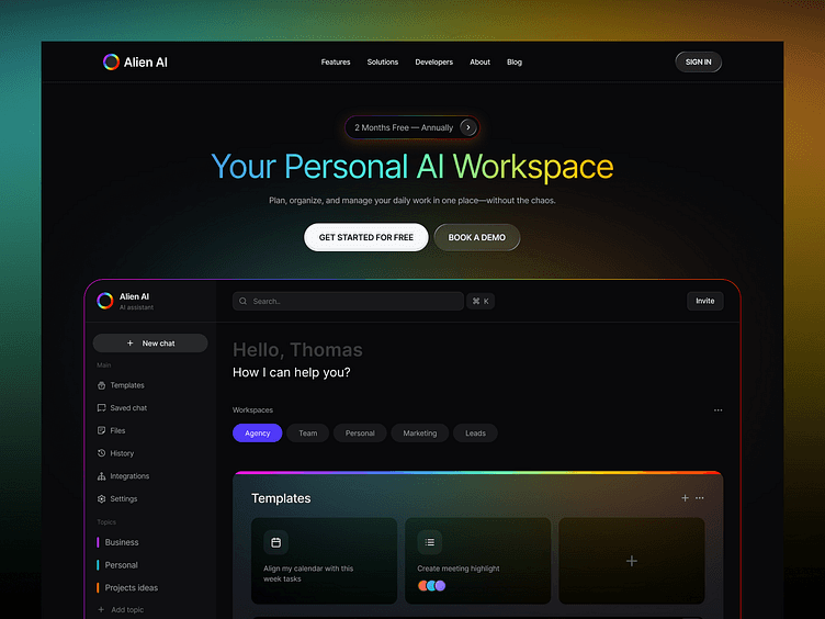
Building a modular design system early pays dividends as you scale. Create reusable components for buttons, forms, navigation, and typography in your design tool. This consistency speeds up development and ensures your interface feels cohesive across every screen.
Essential preparation steps:
Define 3-5 measurable UX goals tied to business outcomes
Select a framework that matches your team size and product stage
Build a component library with reusable UI elements
Conduct lightweight user research through interviews or surveys
Document design decisions and rationale for future reference
Gather user insights early, even with limited resources. Rapid interviews or prototype testing can uncover critical usability barriers that shape product direction. You don’t need expensive research studies. Five user interviews often reveal the most common pain points.
Preparation Element | Purpose | Tool Examples |
|---|---|---|
UX goals | Measure design impact | Google Analytics, Mixpanel |
Design framework | Guide decisions | Design Thinking, Lean UX |
Component library | Ensure consistency | Figma, Sketch, Adobe XD |
User research | Validate assumptions | UserTesting, Maze, Lookback |
Explore crafting seamless UI experiences to understand how thoughtful preparation translates into intuitive interfaces that users love.
Pro Tip: Document your design decisions in a simple shared document. When team members question a choice later, you’ll have clear reasoning to reference instead of relitigating decisions.
Executing UI design: Best practices for mobile and web interfaces
Now you’re ready to design. Focus on creating interfaces that guide users naturally without requiring explanation. Your navigation, interactive elements, and layout should feel invisible, working so smoothly users barely notice them.
Start with navigation design. Users rarely follow the happy path; they explore, backtrack, and get lost. Good navigation is invisible. Limit your main menu to 5-9 items to prevent overwhelming users. Too many options create decision paralysis.
Navigation best practices:
Combine icons with text labels so users don’t have to guess meanings
Display page titles or breadcrumbs so users always know their location
Place back buttons where users expect them, typically top-left
Support keyboard navigation and screen readers for accessibility
Use clear visual states (active, hover, disabled) for all interactive elements
Mobile UI requires special attention to ergonomics. 49% of users hold phones one-handed and navigate with their thumb. Your most important interactive elements should sit within easy thumb reach without users changing their grip.
Design for thumb zones by placing primary actions in the bottom half and center of the screen. Avoid putting critical buttons in the top corners where they’re hardest to reach. Test your layouts by holding a device one-handed and noting which areas feel comfortable versus strained.
Mobile vs. web UI considerations:
Touch targets: Mobile buttons need minimum 44x44 pixel touch targets; web can use smaller click areas
Information density: Mobile screens require more focused content per view; web can display more simultaneous information
Navigation patterns: Mobile favors bottom tabs and hamburger menus; web works well with persistent top navigation
Gestures: Mobile supports swipes and pinches; web relies primarily on clicks and scrolls
Context: Mobile users are often distracted or on the move; web users typically have more attention available
Design Element | Mobile Approach | Web Approach |
|---|---|---|
Primary navigation | Bottom tabs or hamburger menu | Top horizontal menu bar |
Touch/click targets | 44x44 pixels minimum | 32x32 pixels acceptable |
Content layout | Single column, vertical scroll | Multi-column, wider viewport |
Input methods | Touch, gestures, voice | Mouse, keyboard, touch |
Consider edge cases and common user behaviors. What happens when users hit the back button mid-flow? How does your interface handle slow network connections? Designing for these scenarios reduces confusion and frustration.
Learn more about mobile app accessibility to ensure your UI works for all users, including those with disabilities. Accessible design isn’t just ethical; it expands your potential user base.
Pro Tip: Create a “UI audit” checklist covering navigation clarity, touch target sizes, color contrast ratios, and loading states. Run every new screen through this checklist before development.
Verifying and iterating your UI design effectively
Designing your UI is just the beginning. Validation separates assumptions from reality. You need to test, measure, and refine continuously based on actual user behavior and feedback.
Start with rapid prototype testing. Lightweight research methods, such as rapid interviews or prototype testing, can uncover critical usability barriers that shape product direction. Even basic prototypes reveal whether users understand your navigation and can complete core tasks.
Effective validation steps:
Create clickable prototypes of key user flows in Figma or InVision
Run 5-8 user testing sessions asking participants to complete specific tasks
Track where users get stuck, confused, or abandon flows
Measure task completion rates and time to complete against your UX goals
Prioritize fixing the most common or severe usability barriers
Implement changes and test again to validate improvements
Track your measurable UX goals like conversion rates, retention, and task completion times. These metrics tell you whether design changes actually improve user experience or just look different. Data-driven decisions beat opinions every time.
Use agile workflows to manage continuous improvements. Small, frequent updates cost less and reduce risk compared to major redesigns. Learn from web app design workflow strategies that help startups iterate efficiently while controlling costs.
Iteration priorities:
Fix critical path blockers first (issues preventing core task completion)
Address high-frequency pain points affecting many users
Improve areas with low conversion or high drop-off rates
Refine secondary features only after core flows work smoothly
Validate design changes with real user data before scaling. A/B testing lets you compare interface variations and choose the one that performs better. Small improvements compound over time into significant gains in user satisfaction and business metrics.
Pro Tip: Set up session recordings (with user consent) to watch how real users interact with your interface. Seeing actual behavior often reveals usability issues that users don’t mention in interviews.
How TouchZen Media can help with your UI design needs
Designing effective UI requires specialized expertise, especially when you’re racing to launch and iterate. TouchZen Media specializes in UI/UX design tailored for startups and scalable digital products. Our expert team builds user-centered mobile and web interfaces that drive measurable growth and retention.

We understand the unique challenges startups face because we’ve partnered with hundreds of founders navigating the same journey. From initial concept to scaled product, we deliver interfaces that users love and that support your business goals. Explore our recognition as one of the top UI UX design agencies and see why startups choose us.
As a top app developer in California, we combine strategic thinking with hands-on execution. Visit TouchZen Media to learn how we can accelerate your product’s design and launch, turning your vision into an interface that truly works.
Frequently asked questions
How do I start designing a user interface for my startup?
Begin by setting clear, measurable UX goals aligned with your business objectives like conversion rates or user retention. Select an appropriate design framework such as Design Thinking or Lean UX to guide your process. Build a modular design system early with reusable components in Figma or Sketch to ensure consistency. Gather user feedback through interviews or prototype testing before building anything. Focus on creating intuitive navigation and mobile-friendly layouts that accommodate one-handed use. Learn more about user interface design basics to build a strong foundation.
What are the best practices for designing navigation in mobile apps?
Design navigation that guides users by limiting menus to 5-9 items, pairing icons with labels, using clear states, page titles, breadcrumbs, and accessible back buttons. Keep menus concise to reduce overwhelm and prevent decision paralysis. Combine icons with text labels so users understand options without guessing. Use breadcrumbs and visible page titles to orient users within your app structure. Ensure back buttons are easy to find and work with keyboard navigation and screen readers for full mobile app accessibility.
How can I ensure my mobile UI works well for one-handed users?
Since 49% of users hold phones one-handed and navigate with their thumb, place primary interactive elements within thumb reach zones, especially the bottom and center of the screen. Avoid placing key buttons in hard-to-reach top corners where users must stretch or adjust their grip. Design UI that fits natural hand positions to reduce strain and improve usability. Test your designs with real users holding devices one-handed to identify awkward reach points. Prioritize mobile app accessibility to ensure comfortable interaction for all users.
What metrics should I track to measure UI design success?
Track conversion rates for key actions like signups or purchases to measure how well your UI drives business goals. Monitor user retention rates to see if your interface encourages return visits. Measure task completion rates and time to complete to identify friction points in user flows. Track bounce rates and exit pages to find where users abandon your product. Use session recordings and heatmaps to understand how users actually interact with interface elements. Set specific targets for each metric and iterate based on whether design changes move you closer to those goals.
How often should I update my startup’s UI design?
Iterate continuously based on user feedback and performance data rather than waiting for major redesigns. Run small A/B tests every few weeks to validate incremental improvements. Schedule quarterly reviews of your core user flows to identify emerging usability issues. Update your UI when metrics show declining performance in conversion, retention, or task completion. Release updates frequently in small batches to reduce risk and gather feedback faster. Avoid redesigning just for aesthetics; every change should solve a real user problem or improve a measurable outcome.


