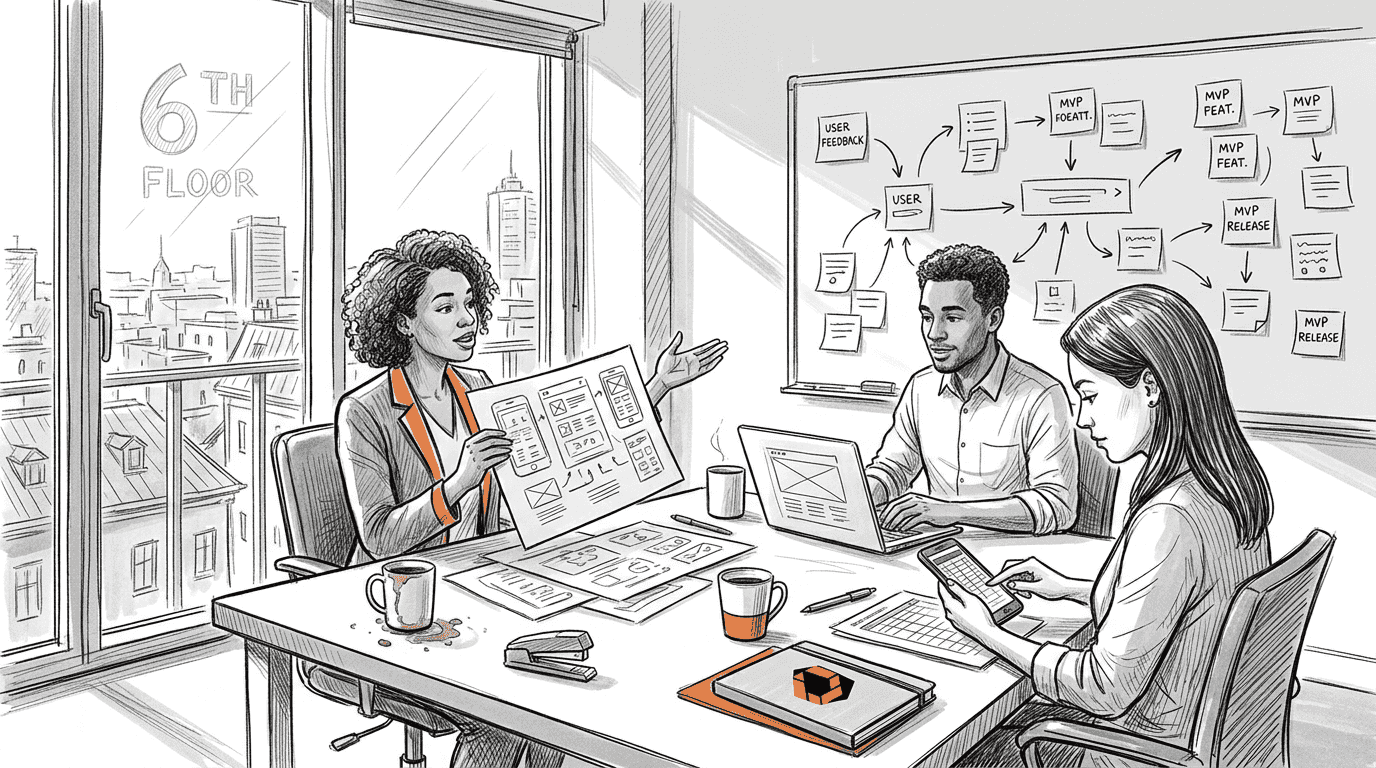
Cyrus Kiani
Founder / CEO


What is UI design in apps? A 2026 guide for startups
Poor UI design causes 88% of users to abandon apps, with most leaving within three days. For startups building mobile applications, this statistic isn't just alarming, it's a wake-up call. Your app's user interface isn't just about aesthetics or visual appeal. It directly determines whether users stick around or vanish forever. Understanding UI design principles transforms how your app engages users, drives retention, and ultimately impacts your bottom line. This guide breaks down the essential UI design concepts every startup founder needs to master in 2026.

Key takeaways
Point | Details |
|---|---|
UI design drives retention | Poor interface design causes massive user abandonment and directly impacts profitability |
Core principles guide decisions | Laws like Hick's and Fitts' provide scientific frameworks for creating intuitive interfaces |
Platform differences matter | iOS and Android require distinct UI approaches that balance native conventions with brand identity |
Accessibility expands reach | Inclusive design and edge case testing ensure apps work for all users in real-world conditions |
Onboarding boosts engagement | Strategic first-time user experiences can increase retention rates by up to 50% |
Fundamental principles of UI design for mobile apps
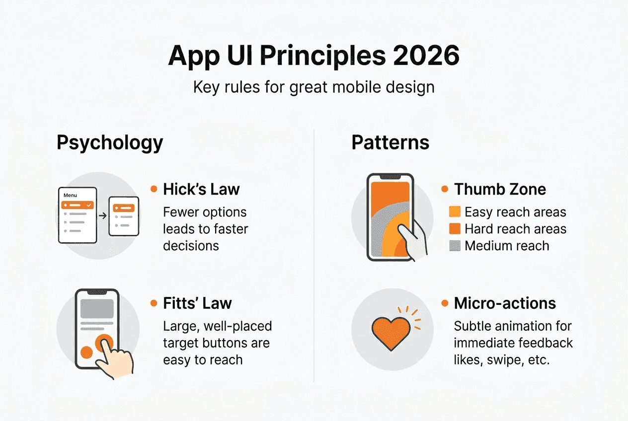
Every successful mobile app interface follows proven psychological and ergonomic principles. These aren't arbitrary design preferences. They're scientifically validated frameworks that predict how users interact with digital interfaces.
Hick's Lawexplains why limiting choices accelerates decision-making. When you present users with too many options, decision paralysis sets in. Smart startups streamline navigation menus, reduce form fields, and prioritize essential actions. Every additional choice increases cognitive load and friction.
Fitts' Law governs touch target sizing. Your buttons and interactive elements need adequate space for accurate tapping. iOS guidelines recommend minimum 44x44 point targets, while Android specifies 48x48 density-independent pixels. Smaller targets frustrate users and trigger accidental taps.
Visual hierarchy directs attention through size, color, and placement. Users scan screens in predictable patterns, typically starting at the top left. Position your most important content and actions where eyes naturally land first. Use contrasting colors for primary buttons and subdued tones for secondary options.
The thumb zone concept recognizes how people actually hold phones. Most users operate devices one-handed, with thumbs doing the heavy lifting. Place frequently used controls in the bottom third of the screen where thumbs reach comfortably. Navigation bars belong at the bottom, not the top.
The 8-point grid system creates consistent spacing and alignment. Every element's dimensions and margins snap to multiples of eight pixels. This mathematical approach produces visual harmony and makes responsive scaling predictable across device sizes.
Micro-interactions provide immediate feedback for user actions. When someone taps a button, it should respond instantly with a visual change, animation, or haptic feedback. These subtle confirmations build confidence that the app registered their input.
Pro Tip: Test your interface with the five-second rule. Show someone your screen for five seconds, then ask what they remember. If they can't identify the primary action or purpose, your visual hierarchy needs work.
Staying current with mobile app UI trends 2026 helps you balance timeless principles with contemporary expectations. Users develop interface literacy from popular apps, creating baseline expectations your design must meet or intentionally subvert.
Cross-platform nuances: designing for iOS versus AndroidiOS and Android evolved distinct design philosophies that influence user expectations. Ignoring these differences creates friction, even if your design looks polished.
iOS embraces minimalism and content focus. Apple's Human Interface Guidelines emphasize clarity, deference to content, and depth through subtle layering. Navigation typically uses a top bar with back buttons, tab bars at the bottom for primary sections, and modal sheets for secondary actions. iOS users expect smooth animations and gesture-based interactions like swipe-to-go-back.
Android's Material Design philosophy celebrates bold colors, shadows, and the floating action button. The FAB, that circular button hovering over content, represents the screen's primary action. Android also uses bottom sheets for contextual options, navigation drawers that slide from the left, and more liberal use of elevation and shadow to indicate hierarchy.
Design Element | iOS Approach | Android Approach |
|---|---|---|
Primary action | Prominent button in natural flow | Floating action button (FAB) |
Navigation | Bottom tabs, top back button | Bottom tabs, navigation drawer, FAB |
Visual style | Flat, minimalist, subtle shadows | Material Design, bold shadows, elevation |
Gestures | Swipe back, 3D Touch (older devices) | Back button (hardware or software) |
Typography | San Francisco font, generous spacing | Roboto font, varied weights |
The tension between platform purity and brand consistency challenges every startup. Should you create completely native experiences for each platform, or maintain unified branding across both? Neither answer is universally correct.
Native purists argue that respecting platform conventions reduces the learning curve. Users already know how iOS or Android apps behave. Matching those patterns makes your app feel familiar and intuitive immediately.
Brand consistency advocates counter that distinctive design builds recognition and differentiation. If your interface looks identical to every other app, you sacrifice memorability. Companies like Instagram and Spotify maintain strong visual identities while adapting navigation patterns to each platform.
Pro Tip: Adopt a hybrid approach. Keep core navigation and interaction patterns platform-native, but apply your brand's colors, typography, and visual style consistently. Users forgive brand-specific aesthetics as long as fundamental behaviors match their expectations.
Consult a comprehensive UI design for startups 2026 guide when planning your cross-platform strategy. The investment in platform-appropriate design pays dividends in user satisfaction and retention.
Optimizing app UI for user retention and engagement
User interface design isn't just about aesthetics or usability. It's a retention engine that directly impacts your startup's survival. The numbers tell a compelling story about why UI matters financially.
A 5% increase in retention can boost profits by up to 95%. That's not a typo. Retained users generate exponentially more value through repeated engagement, purchases, and referrals. Yet most apps hemorrhage users immediately after download.
Onboarding represents your best retention opportunity. Apps with strategic first-time user experiences boost retention 50% compared to those that dump users directly into the interface. Your onboarding should accomplish three goals: demonstrate value immediately, teach essential interactions, and personalize the experience.
Here's how to structure retention-focused UI:
Minimize time to value. Users should accomplish something meaningful within 30 seconds. Don't gate your app behind lengthy tutorials or registration walls. Let people experience core functionality first, then ask for commitment.
Optimize load times ruthlessly. Apps that load in under two seconds retain significantly more users. Every additional second of delay increases abandonment. Use skeleton screens, progressive loading, and aggressive caching.
Provide constant feedback. Users need confirmation that actions registered. Loading indicators, success messages, and error explanations prevent confusion and frustration. Silence after a tap creates anxiety.
Personalize intelligently. Interfaces that adapt to user behavior feel more relevant. Remember preferences, surface frequently used features, and hide complexity until users need it.
Design micro-interactions deliberately. These small animations and transitions make apps feel alive and responsive. A button that subtly scales when pressed, a smooth transition between screens, or a playful confirmation animation all contribute to perceived quality.
Retention Metric | Industry Average | Top Performers | UI Impact |
|---|---|---|---|
Day 1 retention | 25% | 40%+ | Onboarding clarity, immediate value |
Day 7 retention | 11% | 20%+ | Feature discovery, engagement loops |
Day 30 retention | 6% | 12%+ | Habit formation, personalization |
Time to first value | 3–5 minutes | Under 1 minute | Streamlined flows, clear hierarchy |
"The best interface is invisible. Users should accomplish their goals without consciously thinking about the UI. When design demands attention, it's failing." — This principle guides retention-focused interfaces.
Pro Tip: Track your app's time to first value metric religiously. Measure how long new users take to complete their first meaningful action. Every second you shave off this metric improves retention. A/B test different onboarding flows and UI patterns to find what accelerates value delivery.
Explore best UI design practices that prioritize user retention over visual trends. Learn proven mobile app user retention tips that address common pitfalls startups encounter when launching their first apps.
Designing for edge cases: accessibility and real-world testing
Your app won't always run on the latest iPhone with perfect WiFi. Real users encounter spotty connections, older devices, and diverse abilities. Designing for these edge cases isn't optional, it's essential for reaching your full addressable market.
Accessibility compliance expands your potential user base by millions. WCAG guidelines provide concrete standards for making interfaces usable by people with visual, auditory, motor, or cognitive disabilities. These aren't edge cases, they're a significant portion of your audience.
Implement these accessibility fundamentals:
Sufficient color contrast. Text must meet minimum contrast ratios against backgrounds. Tools like contrast checkers validate your color choices automatically.
Scalable text. Users should be able to increase font sizes without breaking layouts. Test your interface at 200% text scale.
Screen reader support. Every interactive element needs descriptive labels. Images require alt text. Navigation must make sense when read linearly.
Touch target sizing. We covered this earlier, but it's doubly important for users with motor impairments. Generous tap targets reduce frustration.
Keyboard navigation. Some users navigate entirely via keyboard or switch controls. Every action must be reachable without touch.
Real device testing reveals problems simulators miss. Testing on actual hardware exposes performance issues, rendering quirks, and interaction problems. Borrow or rent devices across the spectrum, from budget Android phones to flagship models.
Poor connectivity scenarios deserve special attention. Your app should handle:
Slow networks. Implement skeleton screens and progressive loading so users see something immediately, even on 3G.
Offline functionality. Cache essential content and allow basic operations without connectivity. Sync changes when connection returns.
Failed requests. Provide clear error messages and retry options. Never leave users wondering what happened.
Interrupted actions. Save progress automatically. If someone loses connection mid-task, they shouldn't start over.
Data-driven iteration beats following trends. Track metrics like DAU/MAU ratios and time to first value. These numbers reveal whether your UI decisions actually improve user experience or just look modern. Analytics show you where users struggle, abandon flows, or get confused.
AI tools assist UI evaluation, but human testing remains crucial. Automated accessibility scanners catch technical violations. Real users with disabilities reveal whether your app is genuinely usable or just technically compliant. Conduct usability testing with diverse participants throughout development.
Pro Tip: Create an edge case testing checklist covering poor connectivity, accessibility features, older devices, and extreme content scenarios. Run through this checklist before every release. The bugs you catch in testing don't frustrate real users.
Learn more about accessibility in mobile apps and how inclusive design principles benefit everyone, not just users with disabilities. Accessible interfaces tend to be clearer, simpler, and more usable for all audiences.
Explore expert app UI design and development services
Mastering these UI design principles takes time, iteration, and expertise. For startups racing to launch and validate their ideas, partnering with experienced professionals accelerates time to market while ensuring quality.
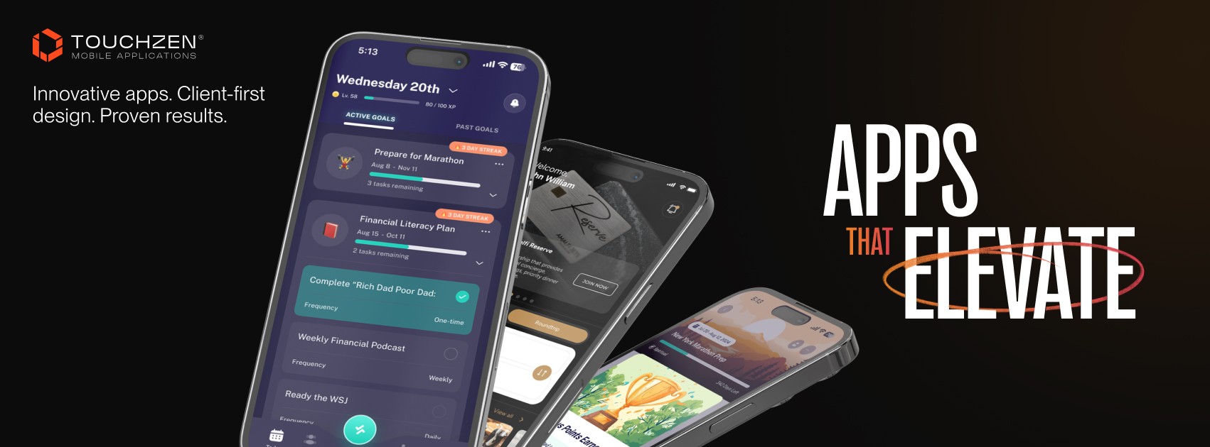
TouchZen Media specializes in designing and developing mobile apps for startups and growing companies. Our team understands the unique constraints and opportunities startups face. We don't just create beautiful interfaces, we build retention-focused experiences that drive business results.
Our approach combines strategic consulting, user-centric design, and native development for iOS and Android. We've helped startups across insurance, health, travel, and fitness sectors create engaging apps that users love and return to daily. Whether you're validating an MVP or scaling an established product, we provide the expertise to make your UI a competitive advantage.
Explore our curated list of top UI UX design agencies or discover why we're recognized as a leading Orange County app development agency. Visit TouchZen Media to discuss how we can transform your app idea into a retention-focused reality.
What is UI design in apps?
What exactly is UI design in mobile applications?
UI design refers to the visual and interactive elements users see and touch in your app. It encompasses layout, typography, colors, buttons, icons, animations, and every pixel on screen. Good UI design makes apps intuitive, enjoyable, and efficient to use.
How does UI design differ from UX design?
UI focuses on the interface's look and interactive elements, while UX encompasses the entire user journey and experience. UI is what users see and touch, UX is how they feel about it. Both disciplines overlap and depend on each other for successful apps.
Why does UI design impact user retention so dramatically?
Users form opinions about apps within seconds of opening them. Poor UI creates friction, confusion, and frustration that drive immediate abandonment. Strong UI design removes barriers, guides users to value quickly, and makes every interaction feel effortless and satisfying.
What role does accessibility play in mobile UI design?
Accessibility ensures your app works for users with diverse abilities, including visual, auditory, motor, or cognitive impairments. Beyond moral and legal obligations, accessible design expands your addressable market and generally improves usability for everyone through clearer layouts and simpler interactions.
What are the emerging UI design trends for 2026?
AI-assisted design tools help optimize layouts and predict user preferences. Data-driven iteration replaces aesthetic guesswork with metrics-based decisions. Personalization engines adapt interfaces to individual user behavior. However, fundamental principles like clear hierarchy, adequate touch targets, and fast performance remain constant regardless of trends.