Cyrus Kiani
Founder / CEO


Insurance isn’t exactly known for being exciting.
That’s what made this project so compelling.
Get Cover approached us with a bold challenge: design and develop a mobile app that engages a younger audience in an industry that traditionally struggles to connect with them. Device protection is essential — especially for students and families — but the experience surrounding it has often felt complicated, outdated, and impersonal.
Our mission was simple:
Make device insurance feel modern, intuitive, and actually enjoyable to use.
The result? A cohesive digital ecosystem that spans a beautifully crafted mobile app and a comprehensive school-focused web portal — bringing clarity, confidence, and energy to device protection.
The Challenge: Making Insurance Relevant to a Younger Audience
Younger audiences expect:
Instant access
Clean, intuitive interfaces
Transparent pricing
Seamless authentication
Zero unnecessary friction
Traditional insurance platforms rarely deliver on these expectations. Complex forms, dense jargon, and confusing coverage breakdowns create distance instead of trust.
For Get Cover, the opportunity was clear:
Reimagine insurance as a digital-first product experience — not just a policy document.
We needed to:
Simplify complex protection plans
Make coverage visually understandable
Reduce onboarding friction
Create trust through clarity
Deliver speed without sacrificing depth
Designing a Mobile-First Experience That Feels Effortless
From the very first interaction, the app was built around simplicity and momentum.
Streamlined Onboarding
Users can sign up in seconds using Apple or Google authentication. No lengthy forms. No friction. Just immediate access to protection options.
The interface uses bold typography, clean layouts, and human-centered imagery to set the tone: this isn’t traditional insurance — it’s modern device protection.
An Intuitive Coverage Dashboard
Once inside, users land on a personalized dashboard where they can:
View protected devices
Check coverage status
See expiration dates
Edit details
Access policy information instantly
Coverage information is presented clearly — no confusing legal blocks or overwhelming fine print upfront.
Simplifying Complex Coverage into Clear Choices
Insurance language can overwhelm users quickly. We redesigned coverage categories into digestible, easy-to-understand options:
Repair Plans
Replacement Plans
Accidental Damage Protection
Theft Protection
Vandalism Coverage
Each option is presented visually and transparently, helping users understand what they’re choosing — and why it matters.
Creating Energy in an Industry Known for Friction
Insurance products often rely on sterile design and formal messaging.
We intentionally did the opposite.
The visual system incorporates:
Bold contrast and modern color palettes
Clean, friendly typography
Engaging photography
Clear calls-to-action
Confident, direct language
Instead of “policy management,” users experience “protection for what matters.”
Instead of complexity, they get clarity.
Instead of stress, they get control.
The app reframes device insurance as a lifestyle safeguard — not a bureaucratic burden.
Building a Seamless Web Portal for Schools and Parents
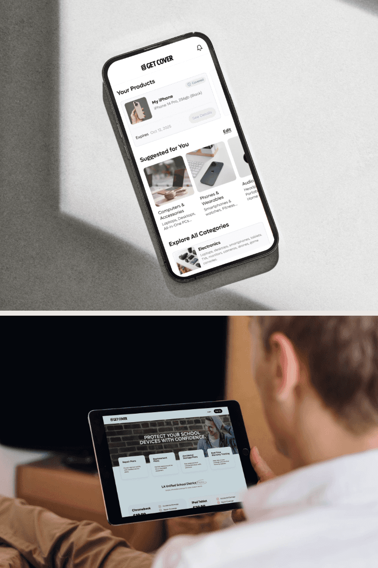
Beyond the mobile experience, we built a comprehensive web portal tailored to school districts and families.
Many districts distribute Chromebooks and iPads to students. Parents need an easy way to secure protection — without navigating traditional insurance systems.
The portal enables:
School-branded coverage pages
Simple annual pricing displays
Clear device-specific plans
Instant enrollment
Transparent feature comparisons
For example, Chromebook and iPad plans clearly outline coverage options such as:
Accidental damage
Repair coverage
Theft protection
Vandalism coverage
Pricing is straightforward and easy to compare, eliminating guesswork for parents.
Designing for Trust, Clarity, and Confidence
Trust is non-negotiable in insurance.
To build that trust digitally, we focused on:
Transparent pricing
Clear expiration timelines
Real-time coverage status indicators
Simple editing options
Consistent visual hierarchy
Straightforward language
Every interaction reinforces confidence.
Users always know:
What’s covered
When it expires
What their options are
How to take action
That clarity transforms insurance from intimidating to empowering.
The Technology & Product Strategy Behind the Ecosystem
The product wasn’t just about design — it required scalable infrastructure and strategic architecture.
We built:
A mobile-first iOS experience
A scalable web portal for school districts
Account-based device management
Flexible plan configuration
Cross-platform synchronization
This ensures schools, parents, and students can interact with the system seamlessly — whether on mobile or web.
The result is a unified ecosystem, not a fragmented insurance platform.
The Result: Insurance That Feels Modern
The transformation delivered:
A device protection app designed for digital-native users
A frictionless onboarding process
Simplified coverage management
A school-ready protection system
A cohesive brand experience across platforms
Most importantly, it shifted perception.
Insurance no longer feels slow, complicated, or distant.
It feels accessible. Clear. Human.
And that changes everything.
Download the App
Ready to experience modern device protection?
Explore Get Cover on the App Store and see how insurance can feel different.