

Cyrus Kiani
Founder / CEO


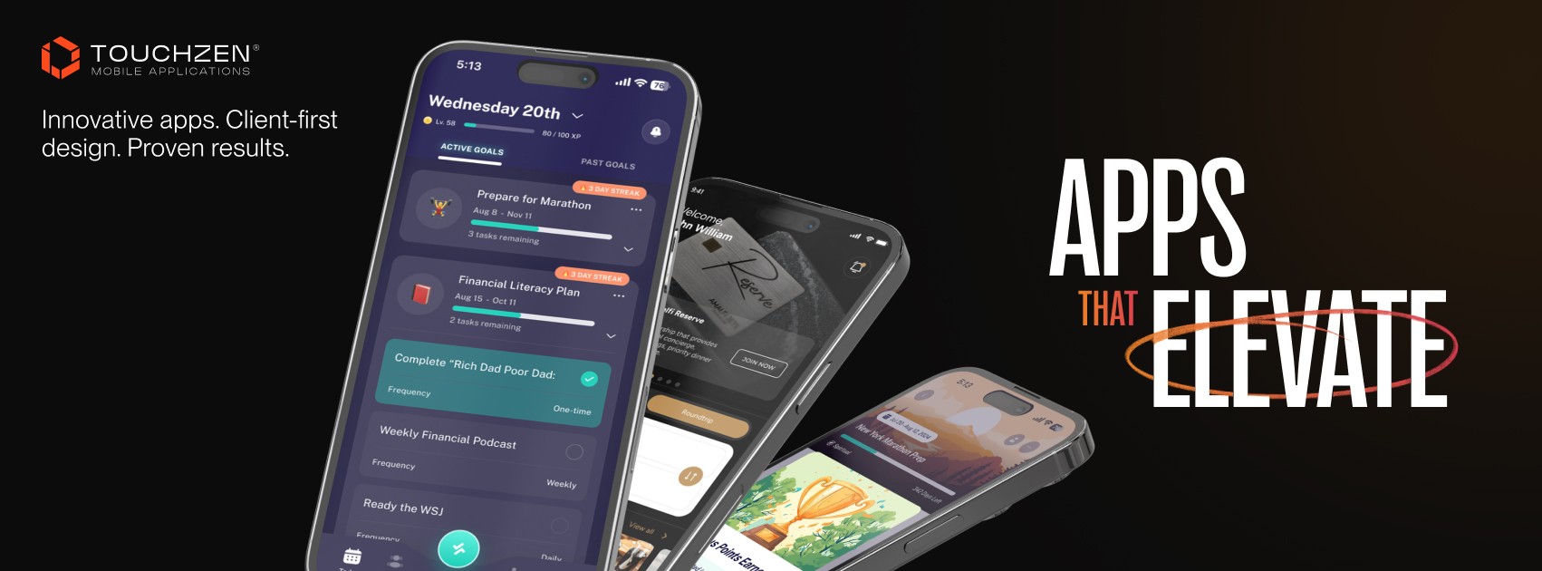
Effective Ways to Improve App User Experience for Startups in 2026
Startup founders face a harsh reality: 77% of users abandon apps within 3 days of download. Poor user experience drives this churn, costing startups both revenue and growth opportunities. Improving UX isn't just about aesthetics; it's about creating intuitive, engaging experiences that keep users coming back. This article explores proven strategies to enhance mobile app user experience, from streamlining onboarding to implementing data-driven personalization. You'll discover actionable methods to reduce churn, boost engagement, and build apps users genuinely want to use. Let's examine the criteria that determine which UX improvements deliver the highest impact for your startup.

Key takeaways
Point | Details |
|---|---|
Simplified onboarding reduces early churn | Limiting onboarding to three screens with interactive tutorials cuts abandonment rates significantly |
Data-driven personalization boosts retention | Moderate personalization and segmented push notifications increase engagement by over 250% |
Accessibility broadens your user base | Meeting contrast standards and thumb zone guidelines improves usability for diverse audiences |
Payment flow choice impacts revenue | In-app purchases convert 33% better than web flows despite platform fees |
Testing validates UX decisions | A/B testing and user feedback ensure improvements align with actual user behavior |
Criteria for evaluating app UX improvements
Before implementing any UX strategy, you need clear benchmarks to measure success. Retention metrics matter most: aim for above 25% day-one retention, 11% day-seven, and 6% day-thirty. These numbers vary by category, but they provide essential targets for evaluating whether your UX changes actually work.
Focus on mechanics like onboarding, navigation, and performance rather than feature bloat. Startups often mistake adding features for improving experience, but users value intuitive interactions over complexity. Prioritize changes that reduce friction in core user flows, especially during the critical first session when users decide whether to keep or delete your app.
Quantitative data from analytics tools reveals where users struggle, while qualitative feedback from interviews and surveys explains why. Combine both to make informed decisions. Track metrics like session length, screen flow completion rates, and feature adoption alongside user sentiment scores.
Balancing innovation with usability presents a unique challenge for startups. You want to stand out, but not at the expense of clarity. Test bold ideas with small user segments before rolling them out broadly. This approach lets you innovate while maintaining the intuitive experience that keeps users engaged.
Pro Tip: Create a UX scorecard that weights improvements by implementation cost versus expected retention impact. This helps you prioritize quick wins that deliver measurable results without draining resources.
For startups building their first app, understanding user interface design principles provides a solid foundation for making strategic UX decisions.
Simplify onboarding and user flow to reduce churn
Your onboarding sequence makes or breaks first impressions. 21% of users abandon apps after one use due to confusing initial experiences. The solution? Limit onboarding to three screens maximum and make each one count.

Interactive tutorials beat static instruction screens every time. Instead of explaining features upfront, guide users through actions as they explore. Show them how to complete their first task, then let them discover additional features organically. This approach reduces cognitive load and creates immediate value.
Guest access removes friction for users who want to explore before committing. Let them experience core functionality without registration, then prompt for account creation when they're ready to save progress or access premium features. This strategy significantly improves conversion rates compared to forced registration.
Your onboarding messaging should answer one question: what's in it for me? Skip generic welcome messages and company history. Focus on the specific problem your app solves and how quickly users can benefit. Keep text brief, using clear language that resonates with your target audience.
Consider these onboarding best practices:
Use progress indicators so users know how many steps remain
Allow skipping for experienced users who want immediate access
Highlight one key feature per screen to avoid overwhelming new users
Test different onboarding flows to identify what resonates best
Pro Tip: Implement contextual onboarding that triggers when users first encounter specific features rather than dumping all instructions upfront. This just-in-time approach improves comprehension and retention.
Staying current with mobile app UI trends helps ensure your onboarding feels modern and intuitive to users familiar with popular apps.
Leverage data-driven personalization and push notifications
Personalization drives retention, but moderate levels work best. Too little personalization makes your app feel generic; too much feels invasive. The sweet spot involves tailoring content based on user behavior and preferences without requiring excessive data input.
Offer opt-in product tips and personalized digests that help users get more value from your app. Users who engage with these features show significantly higher retention rates. The key is making personalization feel helpful rather than creepy by being transparent about what data you collect and how you use it.
Push notifications, when done right, increase engagement by over 250%. When done wrong, they're the fastest path to uninstalls. Segment notifications based on user behavior and limit frequency to prevent fatigue. A user who opens your app daily needs different notifications than someone who hasn't engaged in weeks.
Generic notification blasts like "We miss you!" or "Check out what's new!" perform poorly. Instead, send notifications tied to specific user actions or interests. If a user frequently checks a particular feature, notify them when relevant updates occur. This relevance makes notifications valuable rather than annoying.
Effective notification strategies include:
Time notifications based on when users typically engage with your app
Let users customize notification preferences during onboarding
Test different message formats to identify what drives opens
Include actionable content that provides immediate value
Respect user choices when they disable certain notification types
A/B test notification timing, content, and frequency to optimize performance. What works for one user segment may annoy another. Use analytics to identify patterns and refine your approach continuously.
For broader user acquisition strategies that complement your retention efforts, explore mobile app marketing approaches that reduce costs while improving quality.
Design for accessibility and optimal mobile interaction
Accessibility isn't optional; it's essential for reaching your full potential user base. Implement thumb zone guidelines and maintain 44x44pt minimum touch targets to ensure comfortable interaction. Most users hold phones one-handed, so place primary actions within easy thumb reach.
Color contrast ratios must meet 4.5:1 standards for visibility. This benefits users with visual impairments and improves readability for everyone in bright sunlight or low light conditions. Test your color schemes with accessibility tools before finalizing designs.
Designing for motor impairments and low-end devices expands your addressable market significantly. Not everyone has the latest flagship phone or perfect dexterity. Generous touch targets, clear visual feedback, and forgiving gesture recognition make your app usable for more people.
Game-like testing uncovers edge cases traditional QA misses. Have team members try using your app with one hand while walking, with gloves on, or in direct sunlight. These real-world scenarios reveal usability issues that analytics alone won't catch.
Accessibility improvements that enhance overall UX:
Provide text alternatives for images and icons
Support dynamic type sizing for users with vision needs
Ensure interactive elements have clear focus states
Test with screen readers to verify navigation logic
Optimize for both iOS VoiceOver and Android TalkBack
Accessibility Feature | UX Benefit | Implementation Priority |
|---|---|---|
High contrast ratios | Better readability in all conditions | High |
Large touch targets | Reduced misclicks and frustration | High |
Screen reader support | Access for visually impaired users | Medium |
Dynamic text sizing | Comfortable reading for all ages | Medium |
Gesture alternatives | Options for users with motor limitations | Low |
Pro Tip: Run quarterly accessibility audits using automated tools and manual testing with assistive technologies. This proactive approach catches issues before they impact users.
Learn more about implementing accessibility standards that make your app usable for everyone.
Compare in-app purchases and web subscription flows
Your payment flow choice significantly impacts conversion and revenue. Web subscription flows drop initial conversion by 33% compared to in-app purchases. Users who leave your app to complete payment on the web are far less likely to convert, even when avoiding platform fees.
In-app purchases provide seamless, trusted payment experiences. Users stay within your app, benefit from saved payment methods, and complete transactions in seconds. This friction reduction translates directly to higher conversion rates despite the 15-30% platform fees.
Web flows do generate 6% lower revenue overall when accounting for the conversion drop. While you keep more per transaction without platform fees, fewer users complete purchases. For most startups, the higher conversion from in-app purchases outweighs the fee savings.
Certain scenarios favor web flows. If your app targets enterprise customers who prefer invoice-based billing, web payments make sense. Similarly, apps with very high-value subscriptions may benefit from the fee savings despite lower conversion.
Payment Method | Conversion Rate | Revenue After Fees | Best For |
|---|---|---|---|
In-app purchases | Baseline (100%) | 70-85% of gross | Consumer apps, impulse purchases |
Web subscriptions | 33% lower | 94% of gross (6% net loss) | Enterprise, high-value subscriptions |
Hybrid approach | 15% lower | 80-90% of gross | Apps with diverse user segments |
Test both approaches with different user segments to determine what works for your specific audience. Some startups implement hybrid models, offering in-app purchases as the primary option while providing web payment alternatives for users who prefer them.
Consider these factors when choosing:
Your target customer's payment preferences and behavior
Average transaction value and subscription pricing
Platform fee impact on your unit economics
Technical complexity of maintaining multiple payment systems
For implementation guidance, review payment integration options that balance conversion optimization with technical feasibility.
Looking for expert app development and UX design?
Implementing these UX strategies requires both technical expertise and design finesse. TouchZen Media specializes in building mobile apps that users love, combining proven UX principles with cutting-edge development practices. We've helped startups across insurance, health, travel, and fitness sectors create engaging experiences that drive retention.
Our Orange County app development team works directly with founders to understand your unique challenges and craft solutions that align with your business goals. From initial UX audits to complete app redesigns, we provide end-to-end support that turns user experience problems into competitive advantages.
As top-ranked UX designers and app developers in the USA, we bring both strategic thinking and technical execution to every project. Whether you're launching a new app or improving an existing one, we'll help you implement the UX improvements that matter most for your users and your business.
Frequently asked questions about improving app user experience
What is a good retention rate for startup apps?
Aim for above 25% day-one retention, 11% day-seven retention, and 6% day-thirty retention as baseline targets. These benchmarks vary by app category, with social and gaming apps typically achieving higher rates than utility apps. Track your metrics against category-specific standards to gauge performance accurately.
How long should onboarding be to keep users engaged?
Limit onboarding to three screens maximum, with each screen focusing on one key concept or action. Users abandon apps with lengthy onboarding sequences, so prioritize showing value quickly over comprehensive feature tours. Consider contextual onboarding that teaches features as users encounter them rather than upfront.
What makes push notifications effective without annoying users?
Effective notifications are personalized, timely, and actionable based on individual user behavior and preferences. Segment your audience and send relevant messages at optimal times rather than generic blasts to all users. Always provide clear notification preferences and respect user choices to maintain trust.
Why is accessibility important for mobile app UX?
Accessibility features benefit all users, not just those with disabilities, by improving overall usability and readability. Meeting accessibility standards expands your potential user base and ensures compliance with regulations in many markets. Features like high contrast and large touch targets enhance experience for everyone.
Should startups prefer in-app purchases or web subscriptions?
In-app purchases typically convert 33% better than web flows, making them the preferred choice for most consumer apps despite platform fees. Web subscriptions make sense for enterprise apps or very high-value subscriptions where fee savings offset the conversion loss. Test both approaches with your specific audience to determine the optimal strategy. If users aren't converting at all, explore why your app isn't getting users to identify broader issues.


