TOUCHZEN ®
Local time:
Get Cover
Client
Get Cover
Timeline
5 Months
Launch Year
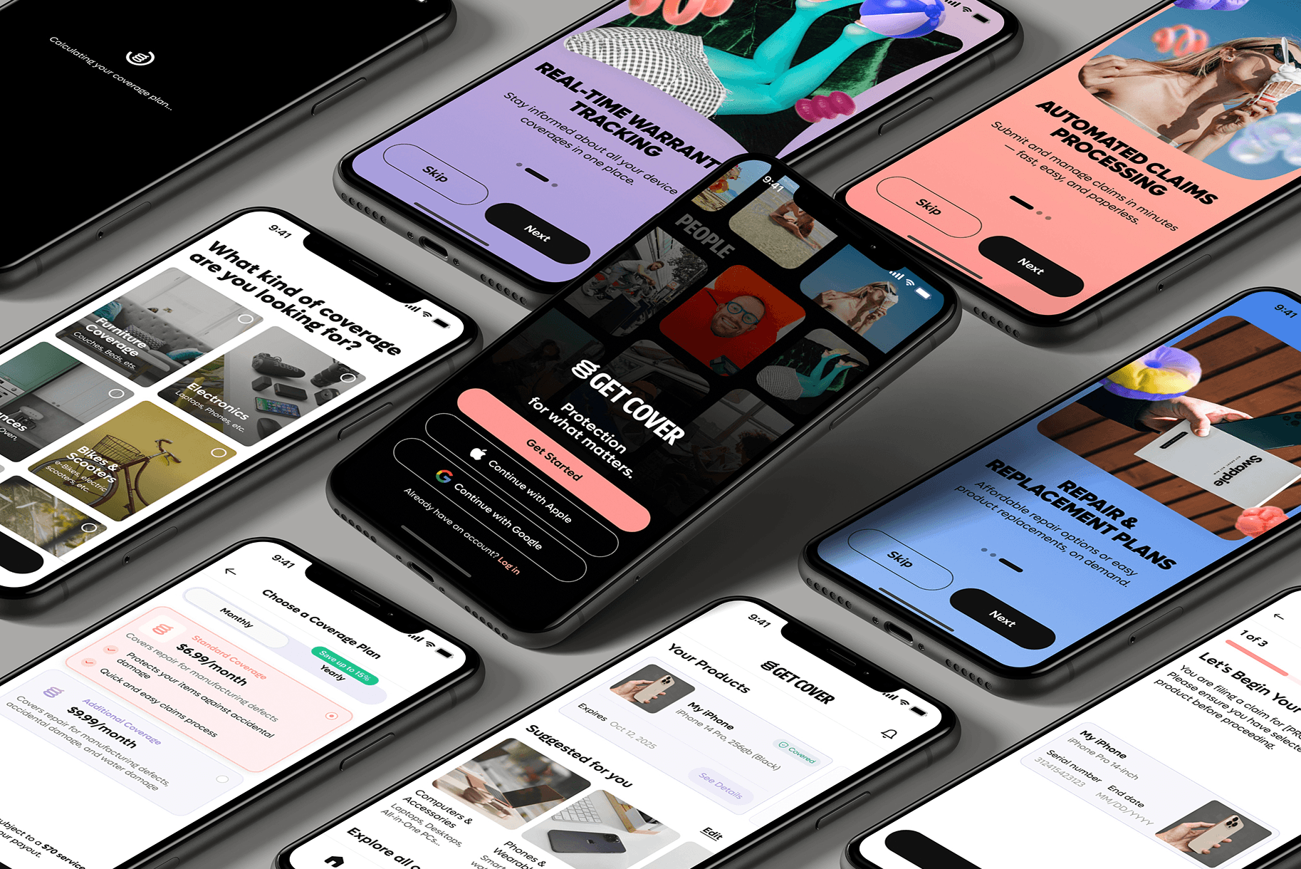
Build an insurance app but make it fun? We got this.
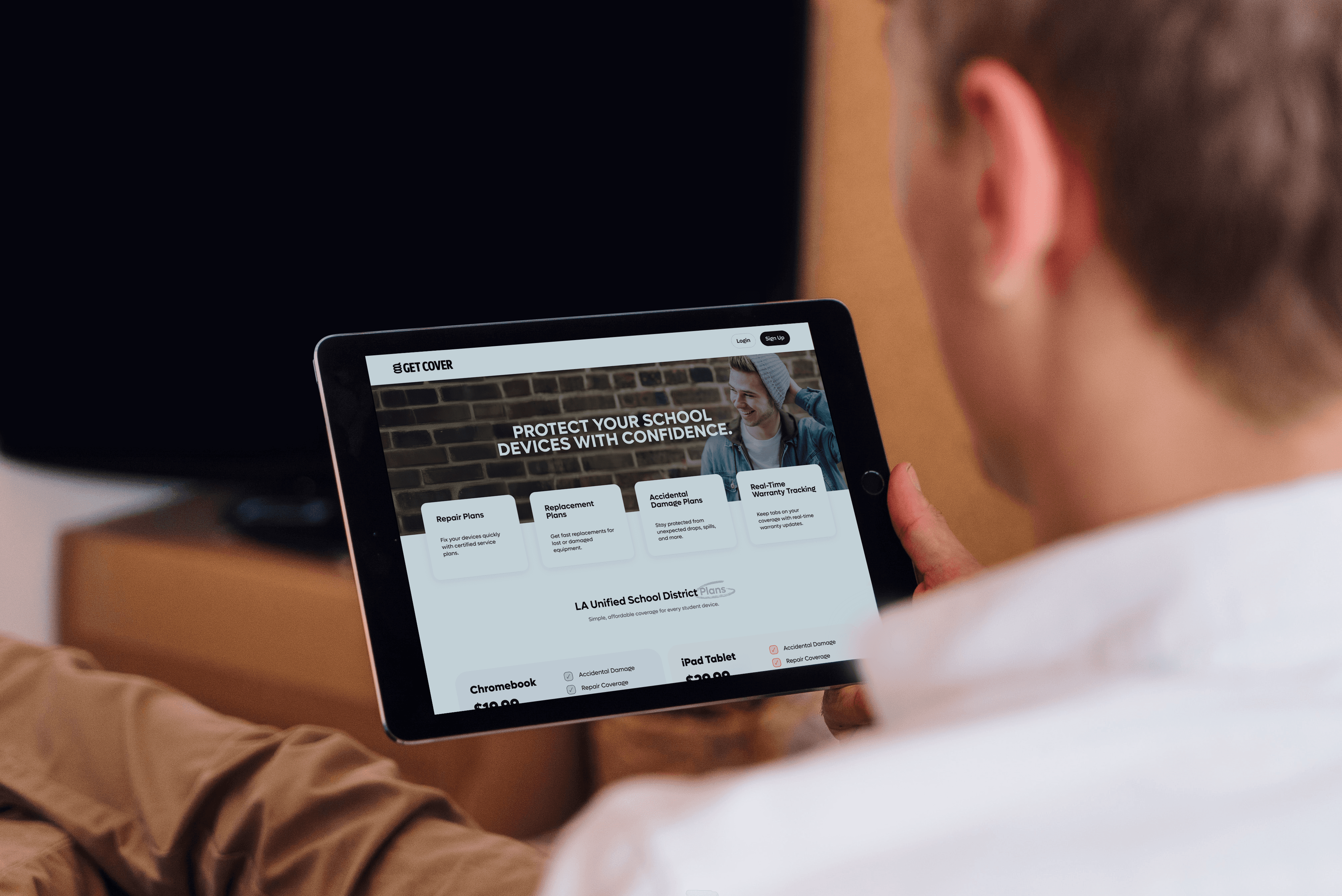
Insurance isn’t exactly known for being exciting. That’s what made this project so interesting. Get Cover hired us to design and develop a mobile app built specifically to engage a younger audience, in an industry that traditionally struggles to connect with them. We brought energy, clarity, and a modern user experience to device protection, making it simple, intuitive, and actually enjoyable to use. Beyond the mobile experience, we also built a comprehensive web portal that enables parents to secure coverage for devices distributed through their school districts, creating a seamless ecosystem across mobile and web.


/Project Goals/
The application was designed to be simple and easy to use, with a strong focus on students and parents. Clear navigation, straightforward language, and an intuitive flow help users understand the service quickly and feel confident while moving through the process. By prioritizing usability and consistency, the experience reinforces a sense of security when exploring and purchasing a service—an essential factor when the target audience includes families and educational communities.

/Results/
We designed a structured flow that guides users naturally through the application, reducing friction and making key actions easy to understand and complete. The interface prioritizes clarity, accessibility, and consistency, ensuring that users can navigate the product with confidence from the first interaction. Overall, the project resulted in a reliable and scalable product that balances business requirements with a strong focus on usability and user experience.
Strategy
Design
Development
/More projects.
Project name
Description